import type { SVGAttributes, TransitionProps, VNode } from "vue";
|
|
/**
|
* Default config
|
*/
|
export const MenuConstOptions = {
|
defaultDirection: 'br',
|
defaultMinWidth: 100,
|
defaultMaxWidth: 600,
|
defaultZindex: 100,
|
defaultAdjustPadding: {
|
x: 0,
|
y: 10.
|
},
|
}
|
|
/**
|
* ContextMenu Component ref interface,
|
* You can use `(this.$refs.myMenu as ContextMenuInstance)` or `const mymenu = ref<ContextMenuInstance>()`
|
*/
|
export interface ContextMenuInstance {
|
/**
|
* Close this menu.
|
* @param fromItem The last clicked menu item, will pass to `MenuOptions.onClose` callback, if user does not click any item, can be `undefined`.
|
*/
|
closeMenu(fromItem?: MenuItem|undefined): void;
|
/**
|
* Check if the menu is currently closed.
|
*/
|
isClosed(): boolean;
|
}
|
|
export type MenuPopDirection = 'br'|'b'|'bl'|'tr'|'t'|'tl'|'l'|'r';
|
export type MenuChildren = MenuItem[];
|
|
|
export interface MenuOptions {
|
/**
|
* The items for this menu.
|
*/
|
items ?: MenuItem[];
|
/**
|
* Menu display x position.
|
*/
|
x: number;
|
/**
|
* Menu display y position.
|
*/
|
y: number;
|
/**
|
* X-coordinate offset of submenu and parent menu.
|
*/
|
xOffset ?: number;
|
/**
|
* Y-coordinate offset of submenu and parent menu.
|
*/
|
yOffset ?: number;
|
/**
|
* Set the mian menu pop-up direction relative to coordinates.
|
*
|
* Default is `'br'`, if `adjustPosition` is true then the menu will determine
|
* the pop-up direction based on its distance from the screen edge.
|
*
|
* @default 'br'
|
*/
|
direction ?: MenuPopDirection,
|
/**
|
* The z-index of this menu.
|
*/
|
zIndex ?: number;
|
/**
|
* Custom menu class.
|
*/
|
customClass ?: string;
|
/**
|
* Set whether users can use the mouse scroll wheel to scroll through long menus in the menu area.
|
*
|
* @default false
|
*/
|
mouseScroll ?: boolean;
|
/**
|
* Determine whether the up/down buttons in the menu item require space holder.
|
* The purpose of this variable is because some menu themes add blank padding above and below the menu,
|
* which are just enough to place up/down buttons.
|
* If there is no blank padding in your custom menu theme, you can set this field to provide blank space for up/down buttons to prevent obscuring menu items.
|
*
|
* @default false
|
*/
|
updownButtonSpaceholder?: boolean;
|
/**
|
* Theme for this menu. Default is 'default'
|
*
|
* |theme|explain|example image|
|
* |--|--|--|
|
* |`default`|Default theme|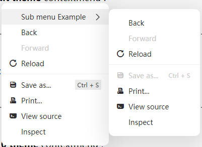|
|
* |`default dark`|Default theme with dark|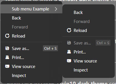|
|
* |`flat`|Simple flat theme|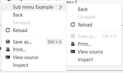|
|
* |`flat dark`|Simple flat theme with dark|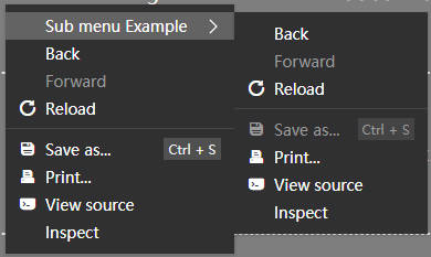|
|
* |`win10`|Win10 like theme|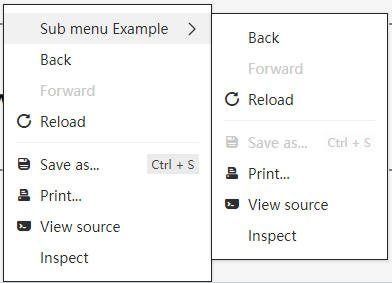|
|
* |`win10 dark`|Win10 like theme with dark|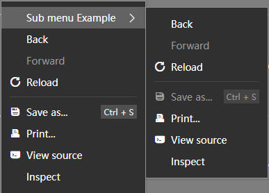|
|
* |`mac`|Mac like theme|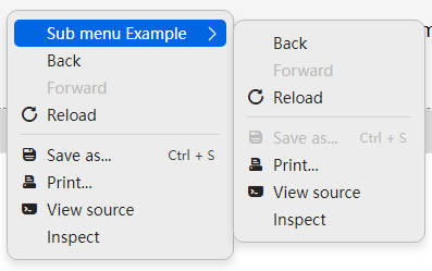|
|
* |`mac dark`|Mac like theme with dark|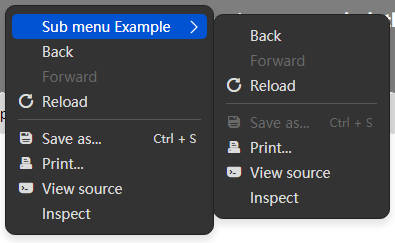|
|
*
|
* You can write new theme in your own css,
|
* customize your theme by overriding the default styles, for example:
|
* ```scss
|
* .mx-context-menu.my-theme-name {
|
& {
|
//Here can override css vars
|
--mx-menu-backgroud: #ececec;
|
--mx-menu-hover-backgroud: #0165e1;
|
}
|
|
//Customize the style of the menu here
|
padding: 8px 0;
|
box-shadow: 0px 5px 7px 1px var(--mx-menu-shadow-color);
|
border: 1px solid var(--mx-menu-border-color);
|
|
//Customize the style of the menu item
|
.mx-context-menu-item {
|
border-radius: 5px;
|
margin: 0 6px;
|
padding: 3px 6px;
|
}
|
}
|
* ```
|
*/
|
theme ?: string;
|
/**
|
* If your element in menu item has this className, click it will ignore event.
|
*/
|
ignoreClickClassName?: string,
|
/**
|
* Set should close menu when the user click on other places.
|
*
|
* @default true
|
*/
|
clickCloseOnOutside ?: boolean;
|
/**
|
* If your element in menu item has this className, click it will ignore event and close hole menu.
|
*/
|
clickCloseClassName?: string,
|
/**
|
* Custom icon library font class name. (global)
|
*
|
* Only for css font icon, If you use the svg icon, you do not need to use this.
|
*/
|
iconFontClass ?: string;
|
/**
|
* The Vue Transition props used when menu show or hide.
|
* @default undefined
|
*/
|
menuTransitionProps ?: TransitionProps;
|
/**
|
* Should a fixed-width icon area be reserved for menu items without icon. (global)
|
*
|
* Default is true.
|
*
|
* The width of icon area can be override with css var `--mx-menu-placeholder-width`.
|
*/
|
preserveIconWidth ?: boolean;
|
/**
|
* Set whether the user can use keyboard keys to control the current menu.
|
*
|
* Default: true
|
*
|
* The control logic is consistent with the Windows right-click menu:
|
* * Escape : Close current menu
|
* * Enter : Click current menu item
|
* * ArrowDown : Select the down menu item
|
* * ArrowUp : Select the up menu item
|
* * ArrowLeft : Back previous submenu
|
* * ArrowRight : Open current menu item submenu
|
* * Home : Select the first menu item
|
* * End : Select the last menu item
|
*/
|
keyboardControl ?: boolean;
|
/**
|
* Maximum width of main menu (in pixels)
|
*/
|
maxWidth ?: number;
|
/**
|
* Minimum width of main menu (pixels)
|
*/
|
minWidth ?: number;
|
/**
|
* Close when user scroll mouse ? Default is true.
|
*/
|
closeWhenScroll ?: boolean;
|
/**
|
* Padding for submenu position adjust. Default is `{ x:0, y: 10 }`.
|
*/
|
adjustPadding?: { x: number, y: number }|number,
|
/**
|
* By default, the menu will automatically adjust its position to prevent it overflow the container.
|
*
|
* If you allow menu overflow containers, you can set this to false.
|
*
|
* Default is true.
|
*/
|
adjustPosition?: boolean,
|
/**
|
* Return the mounted node for MenuRoot.
|
*
|
* Note: After you change the mount node, the menu display position may be incorrect.
|
*
|
* * The MenuOptions.x is the distance from the menu to the left edge of the container (container should `position: relative;`);
|
* * The MenuOptions.y is the distance from the menu to the top edge of the container (container should `position: relative;`);;
|
*
|
* So, you need to change the x and y values you passed in to ensure that the display position is correct.
|
*
|
* You may need to use `ContextMenu.transformMenuPosition` to transform the menu display position:
|
*
|
* ```
|
* function onContextMenu(e: MouseEvent) {
|
//MyContainerElement is the MenuRoot
|
const scaledPosition = ContextMenu.transformMenuPosition(e.target as HTMLElement, e.offsetX, e.offsetY, MyContainerElement);
|
menuData.x = scaledPosition.x;
|
menuData.y = scaledPosition.y;
|
//show menu
|
ContextMenu.showContextMenu(menuData);
|
}
|
* ```
|
*/
|
getContainer ?: HTMLElement | (() => HTMLElement);
|
|
/**
|
* This event emit when this menu is closing. (Usually used in function mode)
|
* @param lastClickItem The last clicked menu item, if user does not click any item, it is `undefined`. This param only valid in function mode.
|
*/
|
onClose ?: ((lastClickItem: MenuItem|undefined) => void) | undefined;
|
/**
|
* Event for MenuBar component
|
*/
|
onKeyFocusMoveLeft ?: (() => void) | undefined;
|
/**
|
* Event for MenuBar component
|
*/
|
onKeyFocusMoveRight ?: (() => void) | undefined;
|
}
|
export interface MenuItem {
|
/**
|
* The label of this menu item.
|
*
|
* Can be a callback. Use `h` to render custom content.
|
*
|
* ```js
|
* {
|
* label: h('div', {
|
* style: {
|
* fontSize: '20px',
|
* color: '#f98',
|
* }
|
* }, "Item with custom render"),
|
* },
|
* ```
|
*/
|
label ?: string|VNode|((label: string) => VNode),
|
/**
|
* The icon for this menu item.
|
*/
|
icon ?: string|VNode|((icon: string) => VNode),
|
/**
|
* Custom icon library font class name.
|
*
|
* Only for css font icon, If you use the svg icon, you do not need to use this.
|
*/
|
iconFontClass ?: string,
|
/**
|
* Should a fixed-width icon area be reserved for menu items without icon. (this item)
|
*
|
* Default is inherit from `MenuOptions.preserveIconWidth` .
|
*
|
* The width of icon area can be override with css var `--mx-menu-placeholder-width`.
|
*/
|
preserveIconWidth ?: boolean;
|
/**
|
* Display icons use svg symbol (`<use xlink:href="#icon-symbol-name">`) , only valid when icon attribute is empty.
|
*/
|
svgIcon ?: string,
|
/**
|
* The user-defined attribute of the svg tag, which is valid when using `svgIcon`.
|
*/
|
svgProps ?: SVGAttributes,
|
/**
|
* Disable menu item?
|
*/
|
disabled ?: boolean,
|
/**
|
* Hide menu item?
|
*/
|
hidden ?: boolean,
|
/**
|
* Is this menu item checked?
|
*
|
* The check mark are displayed on the left side of the icon, so it is not recommended to display the icon at the same time.
|
*/
|
checked ?: boolean,
|
/**
|
* Shortcut key text display on the right.
|
*
|
* The shortcut keys here are only for display. You need to handle the key events by yourself.
|
*/
|
shortcut ?: string|string,
|
/**
|
* Set the submenu pop-up direction relative to coordinates.
|
*
|
* Default is inherted from `MenuOptions.direction`, if `adjustSubMenuPosition` is true then the submenu will determine
|
* the pop-up direction based on its distance from the screen edge.
|
*
|
*/
|
direction ?: MenuPopDirection,
|
/**
|
* By default, the submenu will automatically adjust its position to prevent it overflow the container.
|
*
|
* If you allow menu overflow containers, you can set this to false.
|
*
|
* Default is inherit from `MenuOptions.adjustPosition`.
|
*/
|
adjustSubMenuPosition ?: boolean,
|
/**
|
* When there are subitems in this item, is it allowed to trigger its own click event? Default is false
|
*/
|
clickableWhenHasChildren ?: boolean,
|
/**
|
* Should close menu when Click this menu item ?
|
*/
|
clickClose ?: boolean,
|
/**
|
* Is this menu item separated from the menu item?
|
*
|
* * `true` or `'down'`: Separator is show below menu.
|
* * `'up'`: Separator is show above menu.
|
* * `'self'`: Mark this item is a Separator.
|
* * `false`: No Separator.
|
*/
|
divided ?: boolean|'up'|'down'|'self',
|
/**
|
* Custom css class for submenu
|
*/
|
customClass ?: string,
|
/**
|
* Submenu maximum width (in pixels).
|
*/
|
maxWidth ?: number|string,
|
/**
|
* Submenu minimum width (in pixels).
|
*/
|
minWidth ?: number|string,
|
/**
|
* Menu item click event handler.
|
*
|
* @param e The current event of `click` or `keydown` (when user use keyboard press this menu)
|
*/
|
onClick ?: (e?: MouseEvent|KeyboardEvent) => void,
|
/**
|
* This event emit when submenu of this item is closing.
|
*/
|
onSubMenuClose ?: (() => void) | undefined;
|
/**
|
* This event emit when submenu of this item is showing.
|
*/
|
onSubMenuOpen ?: (() => void) | undefined;
|
/**
|
* A custom render callback that allows you to customize the rendering
|
* of the current item.
|
*/
|
customRender ?: VNode|((item: MenuItem) => VNode),
|
/**
|
* Child menu items (Valid in function mode).
|
*/
|
children ?: MenuChildren,
|
}
|
|
export interface ContextMenuPositionData {
|
x: number;
|
y: number;
|
}
|
|
export declare interface MenuItemRenderData extends Omit<MenuItem, 'children'|'customRender'|'onClick'> {
|
/**
|
* Global theme
|
*/
|
theme: 'light'|'dark',
|
/**
|
* This value indicates whether the current menu submenu is open
|
*/
|
isOpen: boolean,
|
/**
|
* This value indicates whether the current menu has submenus
|
*/
|
hasChildren: boolean,
|
/**
|
* Click event callback of custom element, which is used for menu internal event
|
*/
|
onClick: (e: MouseEvent) => void,
|
/**
|
* MouseEnter event callback of custom element, which is used for menu internal event
|
*/
|
onMouseEnter: (e: MouseEvent) => void,
|
}
|

